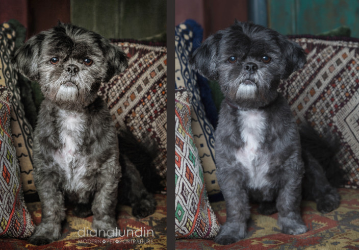
 Now, what's all that jibbah-jabbah about artistically edited? Isn't that pretty high falutin'? I just want to show you something. I have a beautiful image of a dog. Dog is gorgeous. Background has potential.
But the colors are just slightly off. They aren't coherent. There is a blue pipe going up the dog's head. There is a blue pillow but the blue on that doesn't match the pipe. The greens on the door in the back and one of the pillows almost match... but are just off enough to cause this Virgo's brain to revolt.
So into Photoshop it goes.
We completely removed the pipe and extended the green door. Now we have no blue elements except that pillow. So let's change the blue pillow to green. By the way, the blue tones in the green door? Needs to go olive. The green in the pillow on the left? Changed from a kind of bright pastel to a more autumn tone so that color is there but you don't really notice. And the white is competing with our gorgeous dog, so let's take that down a notch.
We've eliminated the collar. It really wasn't bothering me too much but it didn't stand out enough to keep it.
We made his beautiful eyes pop a little, then we took it into a separate software program that enhances fur. We took down the edges of brightness a little more so that there is no question who is the star of the show.
Next we put a texture overlay on top of everything. It immediately gave everything a vintage palette and it gave a very slight vignette so that the dog is more of the center of attention..
Now... don't you think that would look stunning as an art print on premium photo paper in a lovely frame? Or as a canvas? It went from a nice picture straight out of the camera to a piece of art with a color scheme that makes sense.


0 Comments