Now bear with me because this post sounds like it's going to off the rails from the get-go. It probably will.
For years, I've been using a certain shade of seafoam green for my Diana Lundin Photography logo, which then was pretty much duplicated when I created Modern Pet Portraiture by Diana Lundin. For as long as I've been alive, green has been my favorite color, followed by the colors in the aqua and turquoise family.
 Recently, when I needed to make a banner, I added a few stripes (I love stripes) to my pet photography logo to put a little more color, add a little more interest. Pleasing to my eye. My colors.
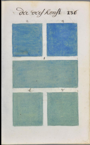
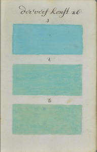
So last week I read about a Dutch author who created a one-of-a-kind, hand-written, 700+ page guide of colors he mixed together -- in 1692. I say "he" but the artist is only identified A. Boogert so he could be a she for all anyone knows. And 1692 is not a typo, that's 271 years before Pantone published its Pantone Color Guide in 1963, according to PetaPixel, where I originally read the article. You can leaf through Boogert's entire book, which resides in Bibliothèque Méjanes in Aix-en-Provence, France by clicking here.
Boogert mixed water colors together and came up with an astounding array of color palettes. I started looking through it and sure enough, my colors were in there. I can't read the headings on the pages but Boogert must have been inspired by the colors of the sea when these palettes were painted.
Right before I saw the article on Boogert's work, I was traveling along the Central California coast. California this time of year is beyond gorgeous and if you haven't driven the coast highway, you owe it to yourself to take a trip along the Pacific Coast Highway. We made some stops along the way -- Pigeon Point Lighthouse near Santa Cruz, Carmel, Big Sur. I snapped some pictures on my iPhone. When I was taking these pictures, I looked specifically at the color of the ocean where the waves were breaking on the rocks. Mixed in with the white foam are the most delicate, beautiful colors.
So yesterday I made my own Big Sur Palette, sampling colors taken from those iPhone images.
These are all from the water, not from the land. And it all circles back -- the colors on my logo, Boogert's water colors, my Big Sur palette.


2 Comments
Dec 30, 2016, 12:21:38 PM
Diana Lundin - Thank you, Angela!
Dec 30, 2016, 11:02:17 AM
angela - One of the nicest color schemes I've ever seen.